How to turn your pencils into inks (or almost this) - Tips for comic artists!
Hey folks, has been a while since my last post! This time I gonna share some tips and tricks that I use on my comic pages work process, to boost the blackness of the lines and make it looks a bit smoother, and then send direct to the colorist. Said this, ok let's go!
1- Scan your art correctly.
Well if you are reading this, you are probably a comic book artist, or you are looking to become one, or in somehow, you are into comics production, and you must know that to make American comics, you must draw the pages in A3 size, with the right margins.
The measurements I obtained by looking at a DC Comics page template, passed to an A3 sheet are: 1.5 cm margin on the sides, 1.0 cm margin on top and bottom, and crop marks placed 6 mm inside the frame, with that you will be within the standard.
For this tutorial, I will use the cover art of the first issue of the Nightfall series by Wingless Comics.
Now to scan your page, unless you are lucky enough to have an A3 scanner, you will need to scan your artwork in 3 parts on a regular A4 scanner and put the 3 parts together in Photoshop. I used version CS6 but is possible to follow this tutorial with other versions of Photoshop.
Open the file of the first part of the scanned page, and cut it down leaving enough space to assemble the page with the other parts to be pasted next.
 |
| Crop the area for the page with the "crop" tool |
Open the file of the second part of the scanned page, copy with the selection tool, using Ctrl + C.
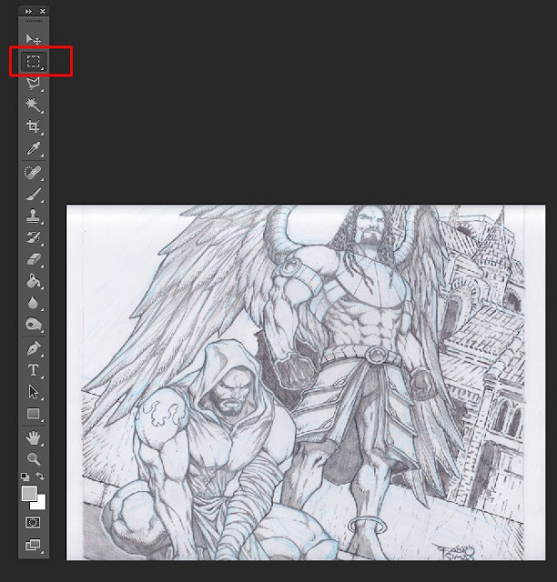 |
| Select the second part of the page with the marquee tool and copy with ctrl+c |
Paste the copied part over the first image, with ctrl + v, and using the eraser, erase the top edge, which is usually blurred because of the scanner's spine.
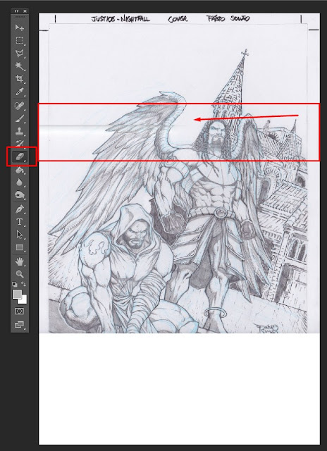 |
| With the eraser tool, erase the top border of the pasted image. |
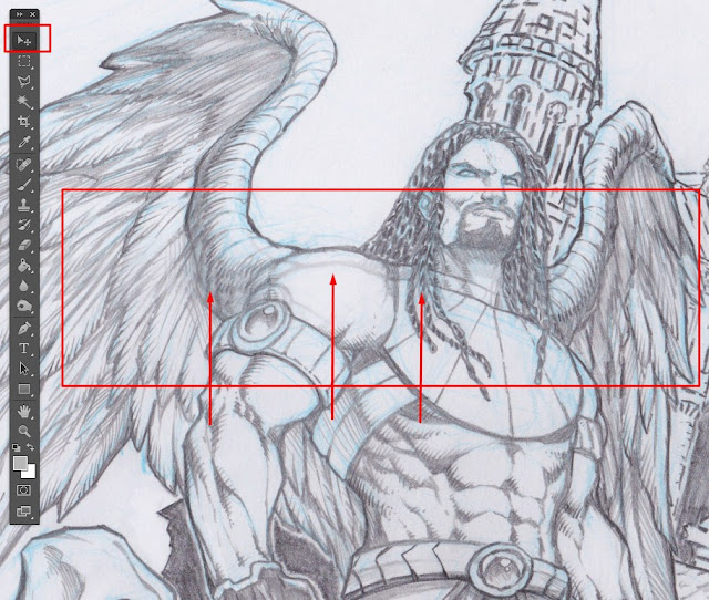
With the "move" tool, drag the pasted image so that it fits perfectly with the first part of the image. Use the zoom to see the details better.
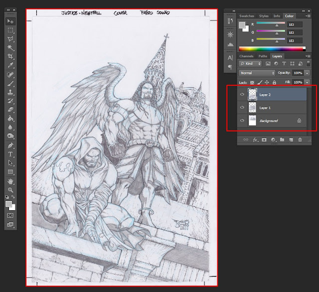
Cut possible leftover space generated in the first cut, and with that, you will have the page assembled correctly.
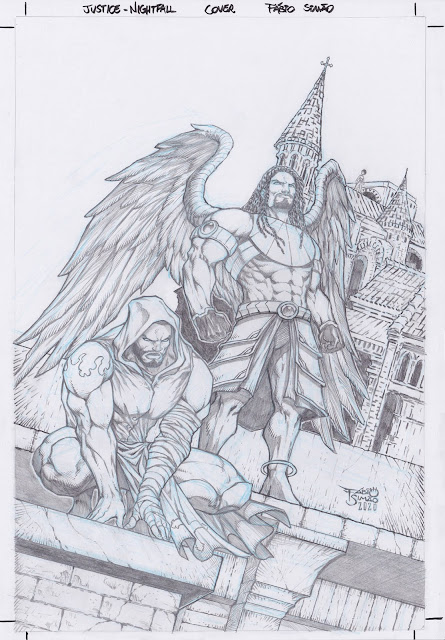 |
| Art assembled from 3 scanned parts. |
2- Hue/Saturation adjustments.
Okay, now we need to remove the colors that we don't want in the image. In my case, I use the blue pencil to lay out the art, and we will use some image adjustments to turn the blue into white, that is, it will disappear! The first setting will be "hue/saturation". In the top menu go to Image> Adjustments> Hue / Saturation, and select all colors except gray, black and white, and increase the brightness to 100%, this will cause the colors to turn to white, leaving only the shades of gray and black intact.
3-Selective color adjustments.
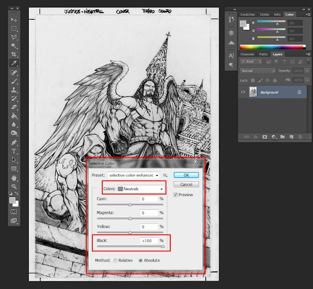
Go to Image> Adjustments> Selective Color, and selecting the gray color, slide the black value to 100%, then select the black color and slide the black value to 100%, and finally select the white color and slide the value black to 0%. This procedure will enhance the dark tones and make the tones more defined.
4-Levels adjustments.
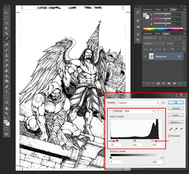
Now go to Image> Adjustments> Levels and slide the left marker towards the center, and then slide the right marker towards the center. This will make the contrast of the image stand out, and the intention here is to make all the small imperfections and light gray tones, as well as dirt and graphite dust, disappear. However, it is necessary to be very attentive so that this adjustment does not damage the quality of the lines in the art. Look for the ideal balance between definition and cleanliness of the art, trying to make your pencil art ready to be digitally colored. Use the zoom whenever necessary, to observe the details accurately.
5-Reduce Noise filter.
In this last step, go to Filter> Noise> Reduce Noise, and slide the "strength" marker to 5, and the "sharpen details" marker to 50%. This will smooth out the pencil strokes, making the lines smoother and the image more homogeneous. Use sparingly, as this filter may end up taking some of the strokes' definition.
6-Finished art, ready for colors!
Great, now you have your art edited and ready to send to the colorist! Tip: To make the jpg or png file lighter, remember to convert the image to "greyscale" mode, which takes up less space since the image is only in black, white and shades of gray, the color information can be discarded. To do this, go to Image> Mode> Greyscale.
Of course, you can save all these settings in your customized presets, or even create "actions" in Photoshop, so you save time every time you do this procedure.
Well, that's it, guys! I hope you enjoyed this tutorial. Follow me on my social networks to follow my work! Thank you very much and see you next time!
Facebook: https://www.facebook.com/fabioartworksprofile/
Instagram: https://www.instagram.com/fabio_artworks/
Deviant Art: https://www.deviantart.com/fabiometalcore





Comments
Post a Comment